

Understanding Micro-Interactions in UX
First, micro-interactions are small interface responses. They occur when users interact with a digital product. For example, they include button effects, success messages, or loading indicators. Although they are simple, they help users understand system responses. Consequently, they create a clearer and more engaging experience.
Key Characteristics of Micro-Interactions
- Clear Feedback: It shows users that their action has been received and processed immediately.
- Specific Purpose: Each visual response connects to a clear function without any unnecessary distraction.
- Proper Timing: It appears at the right moment. Furthermore, it disappears without interrupting the user journey.
How Micro-Interactions Work in Interfaces
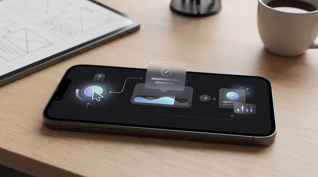
Micro-interactions usually begin with a user action. After that, they are followed by a system response and a visible result. Because of this structured sequence, the interface becomes more predictable. Therefore, users understand what happened without needing extra effort.
Main Interaction Components
- Trigger: It starts the interaction when users tap, swipe, select, or perform any action.
- Response: It provides visual feedback that accurately reflects the current system state.
- Result: It confirms the final outcome. In addition, it helps users move naturally to their next action.
Using Motion to Improve Interface Clarity
Motion is not just a visual feature. It can also explain changes and connect different interface states. When used carefully, subtle animations make transitions much easier to understand. Consequently, they keep the overall experience smooth and focused.
Practical Uses of Motion
- Button Feedback: A subtle visual change confirms that an action has been registered successfully.
- Screen Transitions: Smooth movement helps users understand how one interface state connects to another.
- Avoiding Excess: Too many animations create distractions. Therefore, they make the experience feel much slower.
Using Micro-Interactions to Reduce Errors
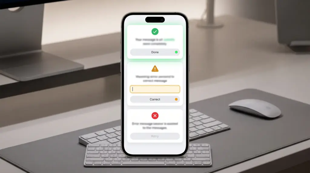
Small interface responses prevent confusion when users make mistakes. They are also useful during sensitive actions. For instance, clear messages and confirmation states help users understand if an action succeeded or if it requires correction.
Ways to Reduce User Errors
- Instant Messages: They explain clearly why information is invalid or why an action cannot be completed.
- Action Confirmation: This gives users a chance to review important actions before final completion.
- Clear States: They visually distinguish between successful, pending, and failed actions.
Improving Response Speed and User Trust
Users feel much more confident when an interface responds quickly and clearly. Even when processing takes time, appropriate feedback makes waiting feel understandable. As a result, it reduces uncertainty during important interactions.
Improving Perceived Interface Speed
- Loading States: Use simple indicators whenever users must wait for information or system processing.
- Immediate Feedback: Change the interface state as soon as possible after a user interaction.
- Shorter Waiting: Avoid long animations if they do not provide any useful information.
Using Interactive Notifications Effectively
Notifications are clear forms of micro-interactions. They inform users about new events without forcing them to search for updates manually. However, their overall effectiveness depends heavily on proper timing, high relevance, and useful actions.
Making Notifications More Useful
- Relevant Information: Display notifications only when the information matters to the current user context.
- Direct Action: Allow users to perform a relevant action right from the notification itself.
- User Control: Give users simple options to manage unwanted notifications and maintain a comfortable experience.
Improving Retention Through Small Details
User retention rarely depends on a single feature. Instead, it results from a consistent experience that makes returning to the product simple. Micro-interactions support this journey by reducing friction and providing continuous feedback.
Elements That Encourage Return Visits
- Clear First Experience: Simple interactions help users understand the interface during their very first session.
- Comfortable Actions: Clear feedback reduces the need to guess what will happen next.
- Consistent Experience: Repeated visual patterns make the interface much easier to learn and use.
Connecting Micro-Interactions to User Behavior
Micro-interactions should be designed around real user behavior. They should not rely on visual appeal alone. By focusing on repeated actions, you can make everyday tasks much easier. This is especially true when small improvements target the parts users interact with most.
Identifying Improvement Opportunities
- Track Repeated Actions: Identify the specific tasks that users perform most often during regular usage.
- Analyze Friction Points: Find moments where users hesitate, repeat actions, or abandon a task.
- Simplify the Journey: Improve frequently used interactions instead of adding unnecessary visual effects.

Measuring the Impact on User Retention
Adding animations or notifications is not enough to prove that the experience has improved. Therefore, the impact must be measured through specific indicators. For instance, tracking retention, task completion, and abandonment rates helps understand real user behavior.
Useful Metrics to Track
- Retention Rate: Measure how many users return after specific periods of time.
- Task Completion: Track whether users can complete important actions without unnecessary friction.
- Abandonment Rate: Identify the exact stages where users leave before finishing their intended task.
Practical Examples of Successful Micro-Interactions
Micro-interactions become valuable when they support a specific user goal. Examples include confirming a like, showing saved content, or communicating loading progress. In popular products, these details make everyday actions feel much clearer and more responsive.
Practical Micro-Interaction Examples
- Like Button: It changes visually after selection to confirm that the interaction was registered.
- Content Saving: It displays a small confirmation that saved content is available without interrupting the user.
- Loading Progress: It shows meaningful progress instead of leaving users looking at a static screen.
Building a Complete Micro-Interaction Strategy
Micro-interactions work best when they are part of a complete UX strategy. They should never be just a collection of isolated effects. Each interaction must have a clear purpose, be tested with users, and be reviewed regularly to maintain a fast and simple experience.
Steps for Building the Strategy
- Set Priorities: Start with frequent actions that have the greatest effect on the user experience.
- Test Changes: Compare user behavior before and after implementation to measure the actual impact.
- Review Regularly: Remove unnecessary interactions and improve those that deliver better results.